Before & After
November 16, 2022
Before & After: A Small Dated Kitchen Becomes A Cool, Modern Hub
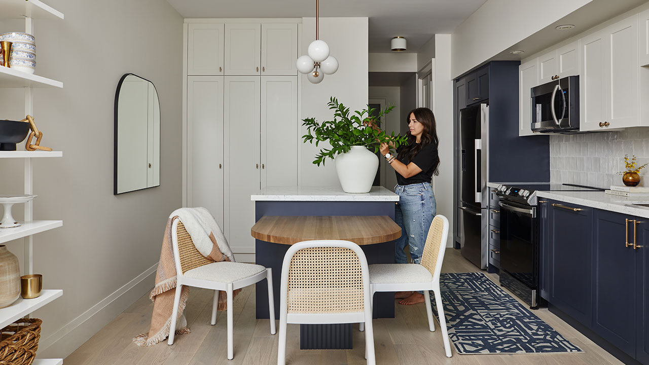
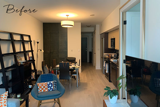
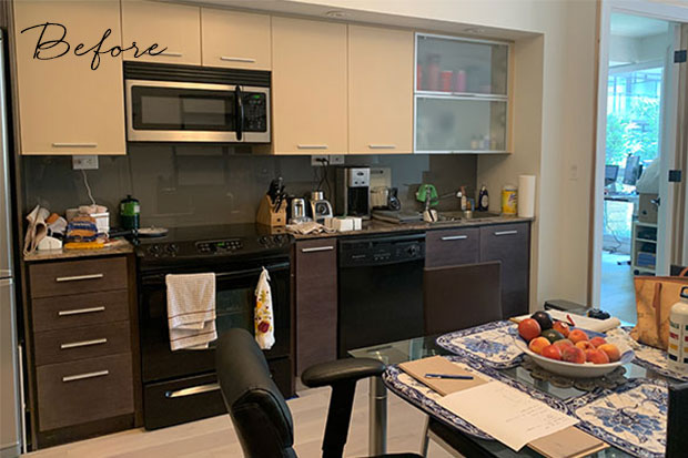
The homeowner of this Toronto condo was desperate for change. She had grown tired of staring at the same four walls and working out of her dull kitchen condo that lacked style and storage. She wanted a kitchen that could accommodate her newly discovered love for cooking and entertaining, and could double as a smart WFH spot. “My favorite part is sitting at my new table. It feels warm, cozy, and clean all at the same time,” she says.
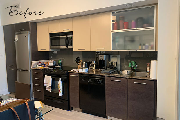
She turned to Toronto-based designer Adriana Pietropaolo with her wish list: maximized storage, new full-size appliances, increased prep space and a dedicated dining area. We chatted with Adriana about her client’s budget, timeline and how she totally transformed the dated 180-square-foot condo kitchen into a bright, hardworking hub.
Scroll down!
H&H: How did you decide on the look for the new kitchen?
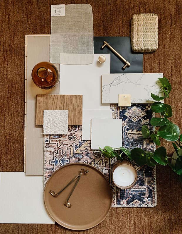
Adriana Pietropaolo Design: Our client had been heavily inspired by the notoriously famous Athena Calderone’s Eyeswoon kitchen and she had a love of mid-century modern design. She recently updated her hardwood floors to a Scandinavian-style light oak which gave us a great foundation to work with. Our design concept was centered around a neutral palette that mixed Scandinavian and MCM details, and layers of texture and contrast.
H&H: What was your client’s budget?
- Millwork & Finishes: $30-40K
- Appliances: $10K
- Fixtures & furnishings: $10K
H&H: What were some of the biggest changes you made?
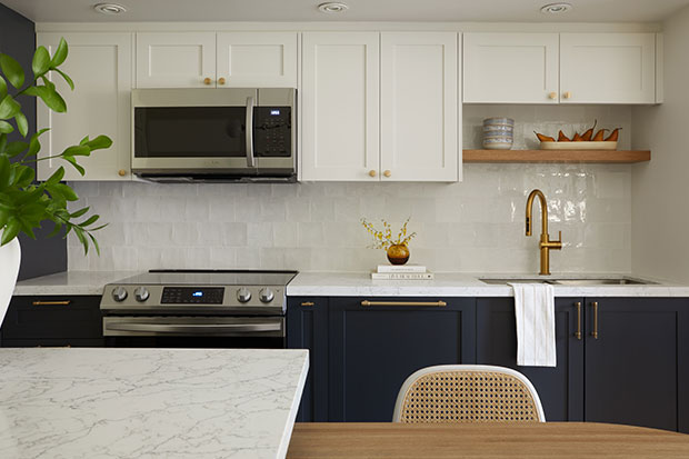
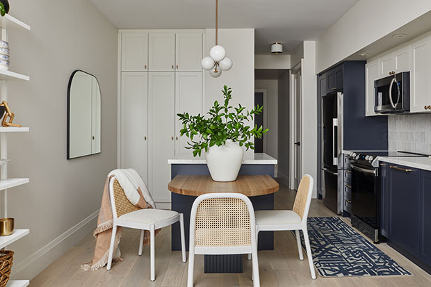
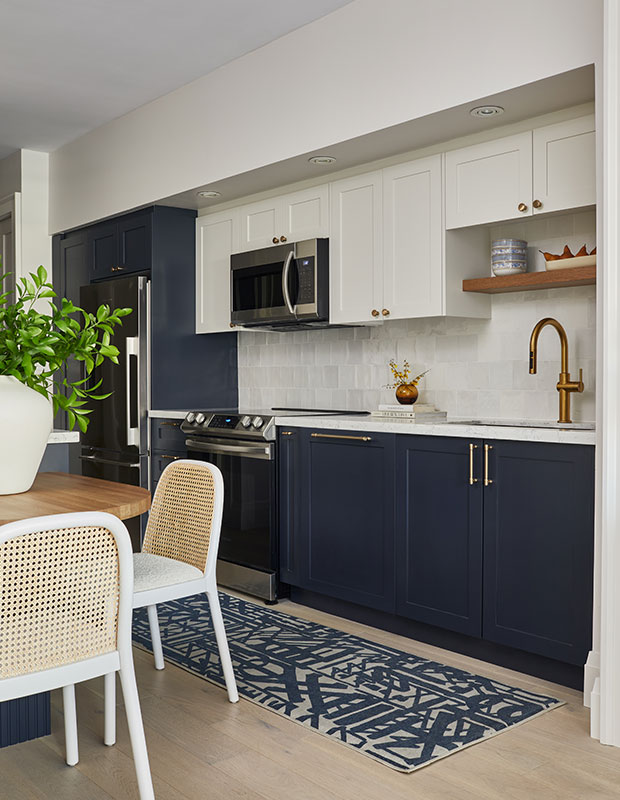
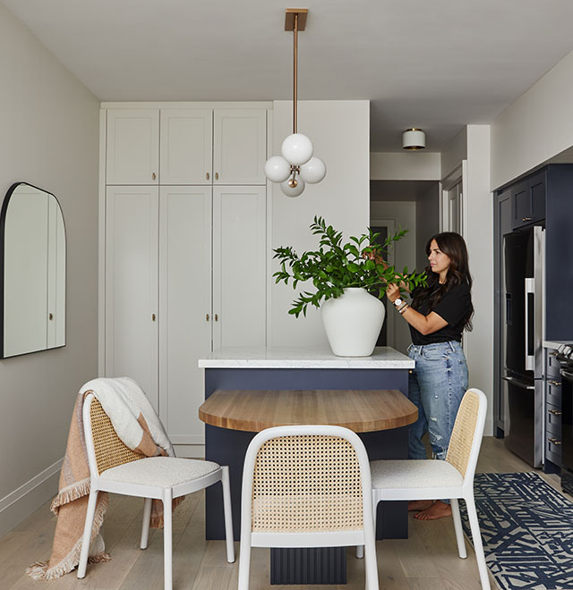
ADP: We swapped out the condo-sized fridge for a full-sized one and installed a panel-ready dishwasher which helps make the small kitchen feel larger. A dual-height island offers my client new prep space, a dining area and loads of storage that the space didn’t have before.
H&H: How did you fit so much kitchen into 180 square feet?
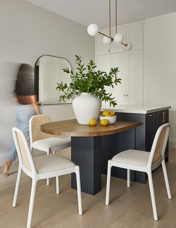
AP: We decided to design a custom two-in-one island, counter-height for prep, table-height for dining or working.
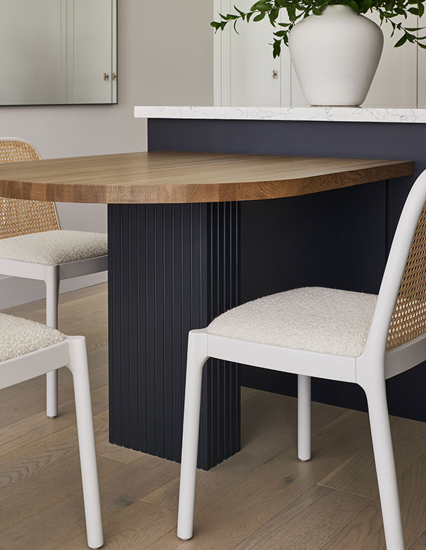
H&H: Tell us more about that dining table
AP: To accentuate the curve of the table, we used solid oak that was stained in a warm mid-tone color. It was important to add texture and distinguish the dining table leg from the rest of the island, so we opted for a linear fluted look and matched the color to the lower cabinets.
H&H: Tell us about how you used color & texture
AP: The cabinets are painted MDF. The upper cabinets and full-height pantry are Sherwin Williams’ Heron Plume and the lowers are Sherwin Williams’ Inkwell. The main metal accents include a brushed brass faucet and hardware (my client’s favorite), stainless steel appliances and hints of white metal and opaque glass in the lighting. A patterned washable rug is art for the floor.
H&H: Tell us about that stunning stone!
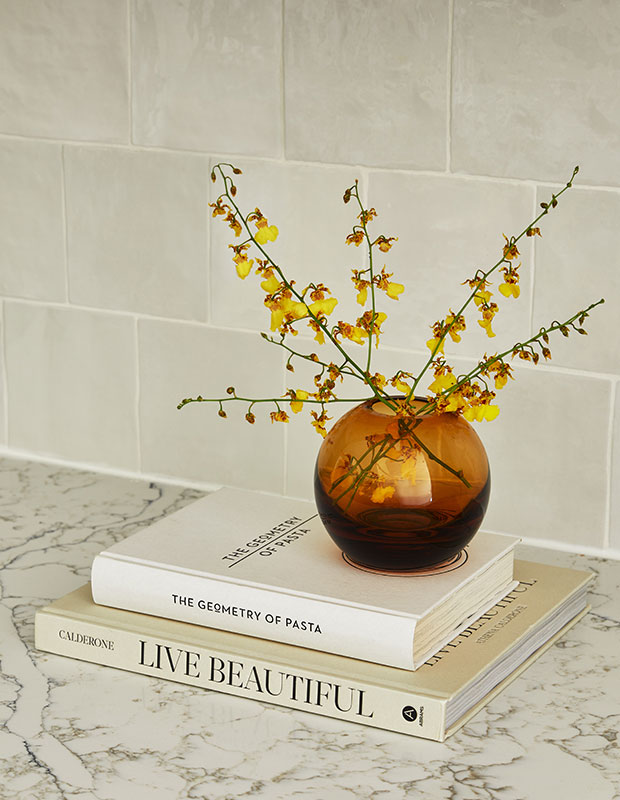
AP: Using quartz on the counters was a no brainer, and we found this beautiful creamy quartz with striking dark blue and charcoal veining. We introduced a textural Zellige-inspired multi-tone white ceramic tile for the backsplash.
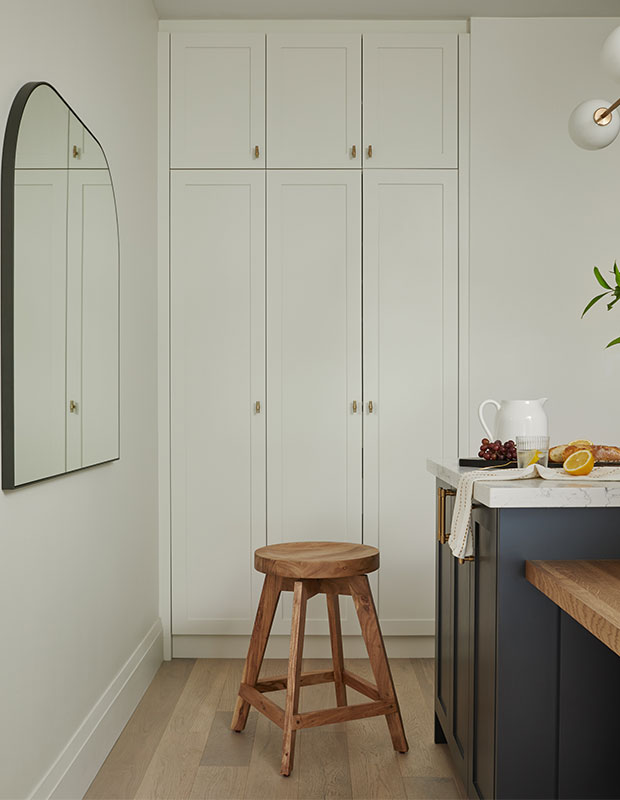
H&H: What changes did you make to the pantry?
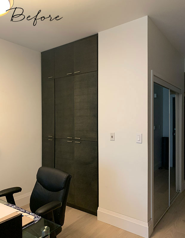
AP: We designed full-height and full-depth custom cabinets that matched the new kitchen cabinets and filled the entire niche cavity – which was deeper than typically found in most condos. We planned out storage based on my client’s needs, plus integrated power outlets for small appliances or vacuum charging. Finally, we matched the brushed hardware from the rest of the kitchen but introduced a finger-pull knob to give some special detail to this millwork.
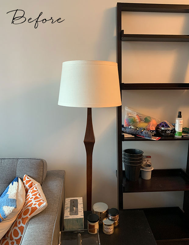
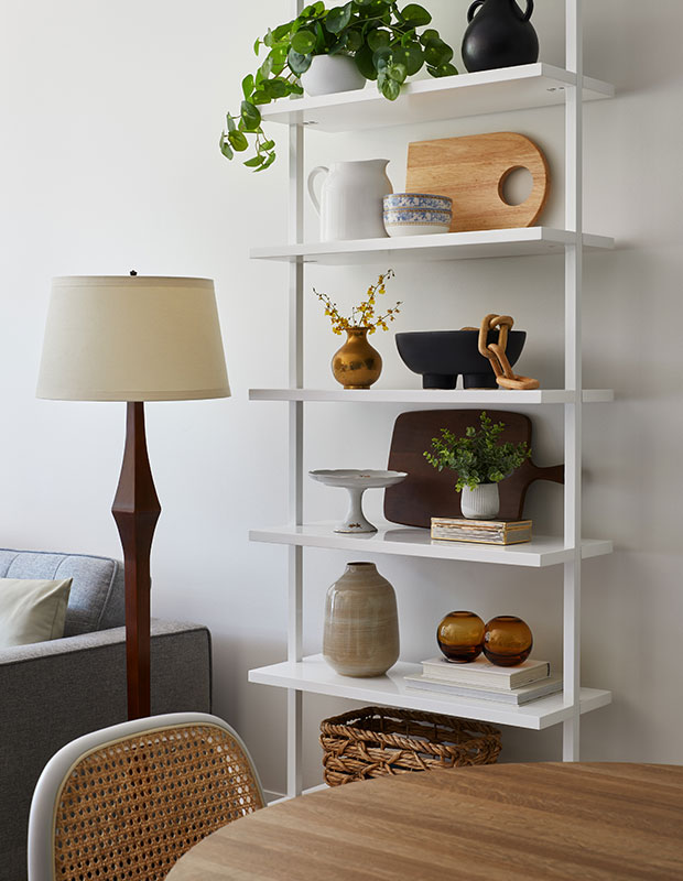
H&H: A bookshelf is a great way to divide up zones in a small space, but it can be tricky to style. What are your best tips?
AP: Think first about the scale and proportion of the bookshelf itself in relation to the rest of the space, then consider the items you might want to display. We opted for a narrow white bookshelf from CB2 that maintained the airiness of the space and was easy to clean.
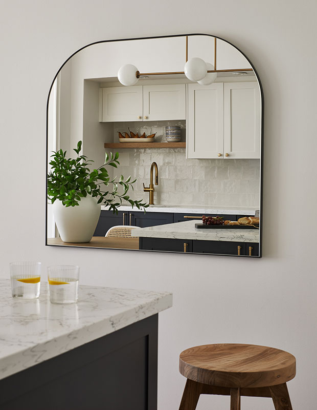
H&H: How did you decide on the accessories?
AP: I knew early on that we would install a mirror on the wall to help make the space feel larger. It might be my favorite part because it reflects the kitchen. We chose an elongated accent pendant so that light would cast over the entire island, providing enough light for cooking and dining. I’m not fond of seeing bulbs so the frosted glass option was key and the brushed brass complemented the hardware perfectly.
H&H: What was the biggest challenge when it came to designing this space?
AP: Determining the final kitchen island floor plan. It was important to meet our client’s need for storage and prep space, but to avoid millwork that felt cumbersome to navigate. Balancing the island with the curved dining table creates effortless flow.
Niamh Barry