Best Paint Colors
September 3, 2015
8 Expert Tips For Painting Furniture
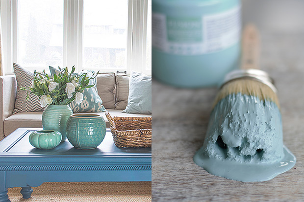
If there’s one thing that can transform a simple piece of furniture into something spectacular, it’s a fresh coat of paint. Michael Penney, decorator, stylist and owner of two home decor shops in Whitby, Ont., happens to agree. He recently launched a furniture paint line with Fusion Mineral Paint that’s inspired by his love of the East Coast. “I get inspiration from all the colors I see in nature and by the seashore when visiting places like Kennebunkport in Maine,” he says. “They have a lot of soft blues, greens and things that are time worn and feel sort of beachy.”
House & Home sat down with Michael to talk color inspiration. Click through to see the Penney & Company Collection and get his tips on how to transform furniture with a fresh coat of paint.
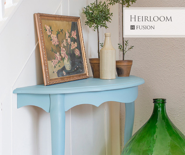
“If the walls are neutral, which in most cases they are, pick an accent color for your furniture that isn’t found in anything else in your space – something that throws off the predictability of your color scheme.”
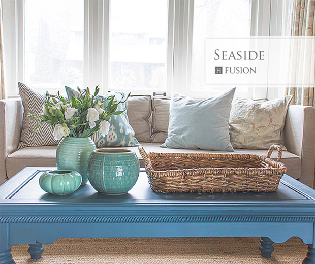
Figure out what colors make you happy — this could be by using tears from design magazine or bookmarking things on Pinterest. Then, use this palette as a starting point for your key spaces. “Throw to the colors you love and that you respond to,” says Michael. “I’ve always been drawn to blues and greens and watery colors. ‘Seaside’ is a wonderful, rich hue with tons of pigment that I love for it’s moody, muddy quality.”
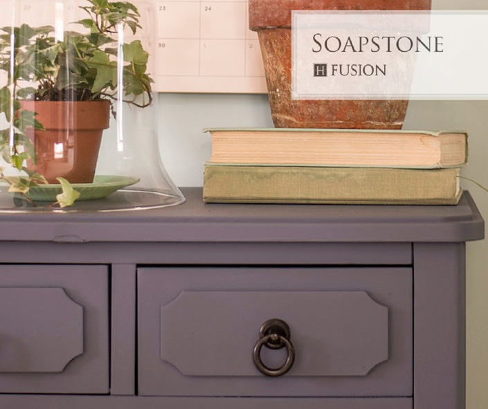
Try painting a board with your chosen color and living with it for at least a week, just to see if to you really like it. If not, consider a toned down version. “Fire engine red may not be something you could live with but you could do a really beautiful burnt orange instead,” says Michael. The collection features these types of toned-down, liveable shades, like “Soapstone,” pictured.
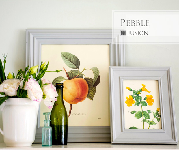
Don’t be afraid to mix lighter, brighter colors with darker tones. Hits of color can come from art, accessories or even flowers. “I like to combine fresh colors like minty green with muddy neutrals to ground them and keep them from being too sweet,” says Michael.
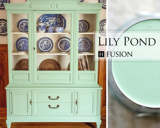
The dusty hues of your grandmother’s furniture? They’re back! “When I was picking all the colors I was thinking of the ones you’d find in an old farmhouse or in an old cottage,” says Michael. His favorite furniture shade in the collection? “For me it’s the ‘Lily Pond Green.’ It’s that old institution of green that was really popular in the early 20th century.”
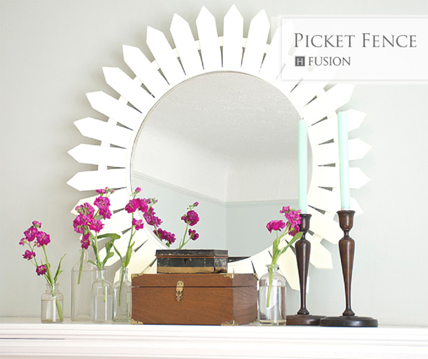
“A lot of people overestimate the value of their antiques. If painting it out means that you’ll use it, enjoy it and embrace it in your home, then I think it’s worth painting and not worrying about the value too much.”
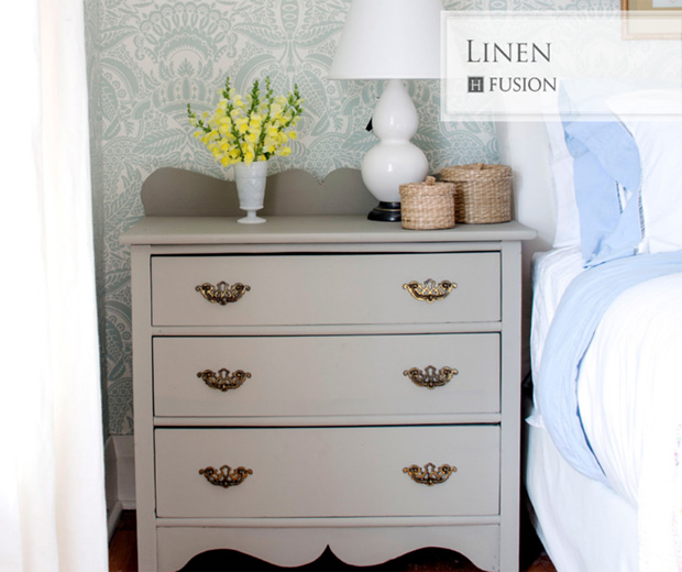
All the paint in the Penney & Company Collection has a matte finish, which offers a vintage, time-worn look. “It’s the perfect flat, historical finish for that authentic aged, cottage-y feel. If you want some luster, just add a coat of bees wax or a layer of Fusion Tough Coat for a mellow sheen.”
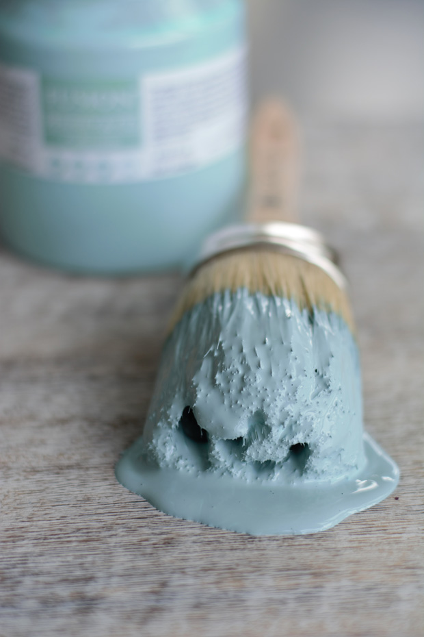
“Paint goes a long way to adding pep to your space in an easy, inexpensive and noncommittal way,” says Michael. If you’re craving color but don’t want the commitment of painting your walls, paint your furniture instead. It’s a great way to try out a new shade and, of course, it’s much easier to change than your walls.
Fusion Mineral Paint